


In Microsoft Excel, we can easily analyze data by using Sparklines. When you select the data, Excel popup a Quick Analysis button on right side of lower corner of data range.
When you will click on the Quick Analysis Button or Press Ctrl+Q, you can see the options like Formatting, Charts, Totals, Tables, and Sparklines etc as mentioned below:

When you select the range of data, then these options will be available as per your data type. E.g. If your data contains only text value, then Sparklines option will freeze or not available as mentioned below:

Before Analyzing the data using Sparklines, we would like to give you a short introduction about Sparkline.
"Sparklines are a small graphical chart inside the single cell of worksheet which is useful to quickly analyze your data"
By Using Following Steps, you can easily create single cell graphical chart by using Sparklines:
Step 1: Select you desired blank cells that you want to show small graphical Sparklines.

Step 2: Now Click on the Insert tab, in the Sparklines group, Click on your desired chart ( Line, Column or a Win/Loss). In this example, we select line graph as mentioned below:

Now you can see that Create Sparklines dialog box will be open as mentioned below:

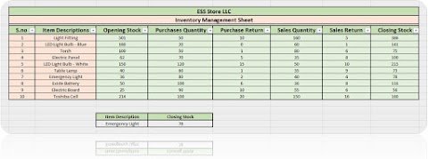
Step 3: Click on Data Range and Select your desired data range that you want to show in the Sparkline. In this example we have selected Sales Revenue range (D5:G9) as mentioned below:

Step 4: Now Click OK to Create Sparklines. Now you can see the result as mentioned below:

Step 5: To Highlight individual values;

Now you can see the result as mentioned below:


Before Analyzing the data using Sparklines, we would like to give you a short introduction about Sparkline.
"Sparklines are a small graphical chart inside the single cell of worksheet which is useful to quickly analyze your data"
By Using Following Steps, you can easily create single cell graphical chart by using Sparklines:
Step 1: Select you desired blank cells that you want to show small graphical Sparklines.

Step 2: Now Click on the Insert tab, in the Sparklines group, Click on your desired chart ( Line, Column or a Win/Loss). In this example, we select line graph as mentioned below:

Now you can see that Create Sparklines dialog box will be open as mentioned below:

Step 3: Click on Data Range and Select your desired data range that you want to show in the Sparkline. In this example we have selected Sales Revenue range (D5:G9) as mentioned below:

Step 4: Now Click OK to Create Sparklines. Now you can see the result as mentioned below:

Step 5: To Highlight individual values;
- Select all your Created Sparklines,
- On the Design tab, in the Show group,
- Tick every Points to highlight individual values in Sparklines.

Now you can see the result as mentioned below:

---Thank You---


1 Comments
great blog bro
ReplyDelete